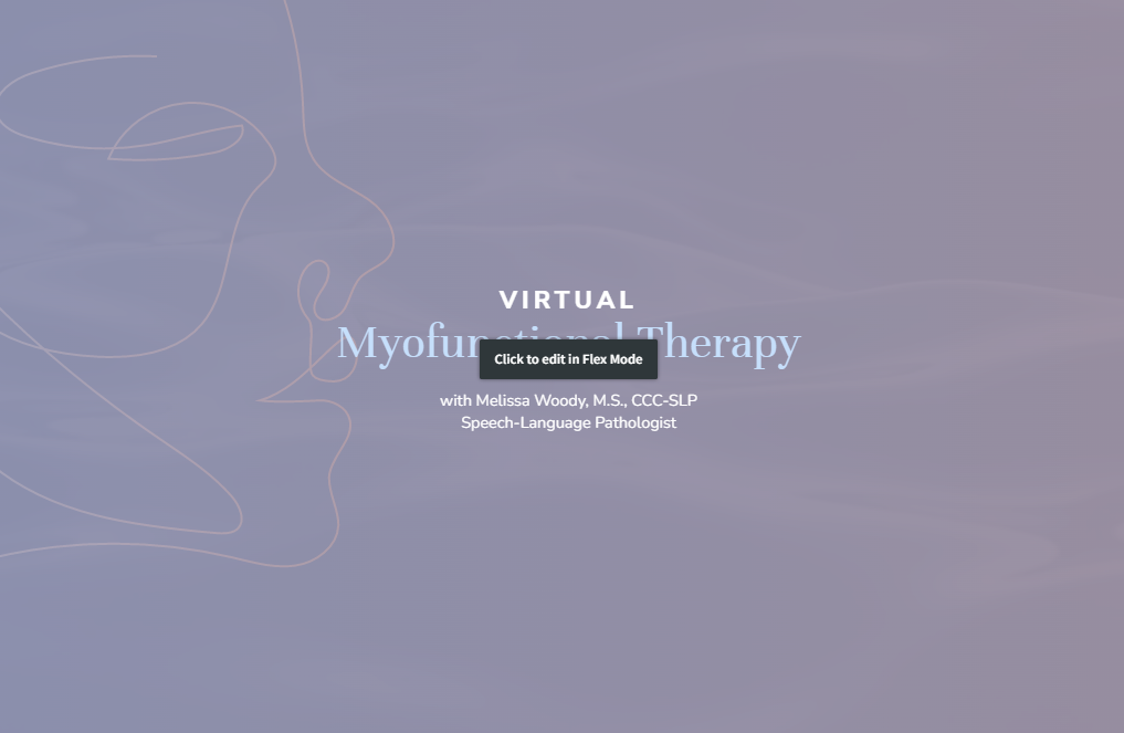
How do you feel about a couple Flex sections tweaks (white overlay/edit)?

I've just posted this on the Idea Board, but per Sheyla's suggestion I'm posting it here as well.
I just find the white overlay to be a bit much and obtrusive as I'm scrolling the site or working with a client on it. I'd rather not have to click Preview to see the section without the overlay.
Perhaps changing the color of the section border from the blue to a green or magenta to indicate a Flex section would work just as well without so much visual impact. Or maybe just the option to turn it off like we have with the animations toggle that was introduced.
Also, the little click to edit button could be moved to the right of the section tab at the top left.
Comments
-
Hi @Justin_Collins!
Thanks for sharing this feedback. I've pinged our team and will circle back if they have any information specific to this request.
1 -
@Justin_Collins a quick update from our team!
First, thanks for taking the time to provide this feedback, we appreciate it! We certainly understand where you're coming from and this is something that our team is considering as we improve the product. In the spirit of transparency, we also wanted to share that we're prioritizing the feature overall and this may not be addressed right away.
We will keep you updated once we have more news 😀
2 -
@Justin_Collins Also, when you share your ideas here, post the link to us so we can click and up vote it for you! I love this idea and will vote it up for you.
1 -
As in share to the facebook page?
0 -
Definitely understand that, happy to hear it's under consideration!
0 -
I think @Aj_Pfeil meant including the link from the Idea Board in your post so others can vote on it! ☺️
0


